Showing posts with label Emma. Show all posts

Thursday, 2 April 2009

Emma Fine - Textual analysis of my finished magazine

After creating my magazine I decided to complete a textual analysis to show my reasons behind my ideas. My magazine is called Burst and is published fortnightly. We decided to create Burst as it is a similar magazine to Smash Hits which is no longer being published; therefore there is a gap in the market. After research into different institutions from our previous textual analyses we decided that EMAP would be the institution that would publish our magazine. This is because they published Smash Hits and our magazine is similar to Smash Hits.

The median of the magazine is print which is in a style of a magazine. The ideologies are to enjoy yourself, love music and be fashionable. This is conveyed by our use of bright colours and referring to music and fashion. The genre of our magazine is pop music which is shown through using pop artists and giving our magazine a bright and bubbly feel. The representation of the magazine is friendly and cheerful; we have represented our audience by the use of colour, language and photographs. The codes and conventions of our magazine also helps represent our target audience as it is obvious it is for a younger market. After research into audiences through a questionnaire we decided to create a magazine for 11-14 year old girls as there was a gap in the market for a music magazine relating to that particular target audience. We also analysed a magazine for different target audiences to discover what particular codes and conventions to use. The narrative of our magazine is informal and friendly language so our audience could understand and relate to our magazine. We looked into the language that our target market uses so we could adapt to it, such as shortening words.

The front cover of Burst is very noticeable as the colours are bright and bold. The masthead automatically catches the reader’s eye as it is large, bold and a bright coloured pink. The colour pink also helps to relate to our target audience as it is most 11-14 year old girls favourite colour. The tagline reads ‘keep in tune with burst!!!’ It is very bold so it stands out and is in the same colour as the masthead. The tagline also shows that it is a music magazine through the word ‘tune,’ therefore consumers will understand what sort if information they will receive from the magazine. On the left hand side is information regarding the issue number, date and price. The bar code has been placed in the bottom left hand corner so it is quick and easy to scan during purchase; it is also in the same area as the other Burst magazines. It is written in much smaller font than the rest because it isn’t used as a main hook to entice the public into buying the magazine as they would be more interested in the cover stories. The main image is what customers will view next as it is very large and bold on the page. It is a medium close up and the model is wearing a white t-shirt and blue jeans as it creates a soft image for my target audience. He is older than my target audience as he would be a suitable role model for them. He is wearing glasses because it shows he has a high celebrity status and it looks cool. He has a guitar strapped on his back to show that he is a music artist which also helps convey that the magazine is a music magazine. The name of the artist Chad is written in a completely different font so that his name stands out and shows how important he is, the orange colour contrasts against the white t-shirt, therefore his name stands out even more. I decided to use a celebrity as a main cover story on the front because from my questionnaire people were more influenced by the celebrity. From my textual analysis of a real magazine I felt that by referring to my interviews as exclusive it will raise the magazines status and show that readers will receive a quality magazine. Therefore underneath his name I included in pink font ‘exclusive interview.’

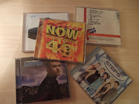
I have placed another picture of my main artist playing the guitar to show that he is a music star and it shows he is concentrating on playing the instrument which shows his passion. The second image is in a different location and emphasizes how important he is in the issue by the use of two different photographs. I have also placed an iconic photograph which is of the NOW 49 album, this helps raise the status of my magazine as it shows it is professional and uses well known brands.

I have placed a second hook on the top of the magazine which reads ‘Free gift!! A CD mixed with fab songs!’ By using many exclamation marks it emphasizes the gift and the CD also influences the readers that it is a music magazine. Although not many people said in my questionnaire that a free gift would entice them to buy the magazine, I decided to use one because I felt it would help because people normally enjoy receiving free gifts.

The other cover stories are written in bright colours that are used through out the magazine to create a house style. They are written in bold font so they stand out. Some story lines are written smaller than others because the larger ones are more important. I emphasized some words such as ‘great NEW tunes’ and ‘real YOU!’ I did this because these words would influence the reader to buy the magazine and by underlining ‘you’ it is directly contacting the audience so they feel more involved in the magazine. Some cover stories are written in shapes so they stand out and present the magazine in an interesting, different and exciting way.

Following my analysis of my front cover I will now look at the contents page. At the top of the page is a huge arrow pointing to the next page in the magazine, this influences the customer to carry on reading the magazine. We have also used eyes which has replaced the letters ‘o’ in look. We did this because we felt it would create a quirky and fun style and it emphasizes that the magazine is written for a younger audience. The masthead our front page is in the top left hand corner to create a code and convention as it is used on everyone’s magazine pages.  It also reminds the consumer that they are reading Burst. We have included an editor’s letter as most magazines use this, especially ones for our target audience. The heart and title ‘Hey sweetie’ provides a personal and friendly feel. In all the Burst magazines, the editor’s letter is written in a handwriting font as it gives a personal impression on the magazine. We have also signed it with our names and included an ‘X,’ this also adds to the personal touch. We each included a photograph of ourselves which was taken by another member of the group, the photograph is in an office setting and shows the editor writing the magazine, the editor is smiling so she looks friendly. Next to the editors letter is the cover stories section which shows where you will find the cover stories in the magazine. A print preview of the magazine has been used instead of text because it looks interesting and is clear to see. This idea was used because it is similar to other magazines that are for the same target audience.

The other stories in the magazine can be found under the title ‘plus tons more.’ The stories are placed into four different sections which are ‘celeb central, music meltdown, style secrets and the regulars.’ The titles are in a different and large font so they stand out well on the page. We have also added a section called ‘the pop factor’ which is refers to music pages and has a brief explanation about what you will find on that page. We decided that our magazine will have 80 pages as it is a national magazine and national magazines normally have a large amount of pages.

At the bottom of the magazine is a subscription note to Burst.  We have used this as a hook because it will influence the readers to buy the magazine as by joining up they will save money. I have written my subscription note in a green background so it stands out against the white background. We have added in pictures of the other pages front pages to show readers the other issues.

We have used a plain white background as the rest is in bright colour and we did not want to draw attention away from the text. Also from our research we noticed that normally the contents page in the magazines also have white backgrounds. We didn’t include many photos because we did not want to draw attention away from the text which is the most important as the contents page is where readers will find the other pages.

Lastly I will analyse my double page spread which is an interview that regards the music artist on the front of the magazine. The first thing the reader will notice is the large photograph of my model. It is a close up photograph and the model is eye level with the reader so they can relate to him. He is also looking straight at the reader so they feel more involved in the photograph and it is a very intimate photo. He is wearing a light grey jumper which contrasts against the brown background so he stands out. In the top left corner is the masthead of the front cover which is used as a code and convention throughout the magazine. At the bottom of the large photograph is information about the interview so the readers know what will be included. It is written in purple font which is the same purple as the front cover to create a house style. Some text in the box is larger than the rest as it emphasises the words and stands out for those that skim read. In the left hand corner is the page number and the website address of burst. I have included a photograph of the model posing with his guitar next to the text, this is an intimate photo as it shows him doing what he loves, and he is smiling to create a friendly atmosphere.

There are other photos which show the star playing football in a different location to the other photographs. The photographs are medium long shot to show the scene he is in. As the celebrity is a role model to the young views it emphasises the ideology that you should be fit and active by playing sports, he is smiling which shows he is enjoying himself; this will help encourage readers to do the same.

From my research I found that most double page spreads include a quote from the interview in large font to influence customers to read the text. Therefore at the top I included the quote ‘Big Ben is awesome,’ the text is in large bright coloured font so it stands out. Throughout the interview I have placed the questions in a purple font and the answers in an orange font; this shows the reader who is talking. I also placed stars next to each question to create an interesting, exciting and young feel to the interview. At the end of the interview I wrote the name of the album and when it will be released as most magazines that I analysed also do this.

As it is a music magazine I included reviews of a band and a different solo artist. The language is very chatty and informal which is understandable for my target audience. This would influence readers to buy their music as I gave them a high rating. The page is very colourful as I used a turquoise faded background and bright coloured font to relate to my young audience.

In conclusion from analysing my own music magazine I have understood the codes and conventions used and the house style that we have created to make our magazine look professional like other magazines. We used the same layout in our magazine as we felt a house style is very important in making our magazine look recognisable. We used ideas from other magazines and developed them in our magazine. I feel that our magazine is very professional and we have effectively achieved our aim for our magazine and it relates well to our target audience. 

First draft of magazine

After completing my first draft of my magazine I decided to create a survey asking my target audience what they thought and any changes that should be made to relate it more to them. Here is the first draft of my magazine and what changes I made.


For the front cover I found out that the picture of him in a dark grey jumper did not relate well to my target audience. This is because it created a harsh look and would have been better if he was wearing a white top; therefore I retook the photograph and placed my model in a white t-shirt. I also enlarged the photograph because the original was too small and did not stand out very well. I removed the shadow as it was too distracting. My audience told me the magazine looked plain because it had a white background, therefore I added in a pink background that faded into white to make it look more professional. The yellow text in the right hand corner was not very visible, after asking what colour they would prefer I used the most popular choice was blue. They also said my text was not bold and large enough.


I received quite a positive response from my contents page. The only changes I was told to make was to remove the text in the cover stories section and replace it with a picture of the front page and refer to it with pointers. In addition as a group we decided to add photographs of each of our front covers in the subscription note to make it look more professional.

Finally for my double page spread I made quite a few changes. I found out that the main photograph should be in a different location and wearing a lighter top. They said the shadow around the model was too distracting. Therefore I retook the photograph and placed him against a brown wooden background and in a grey top to soften the image. I also placed him sideways looking into the camera instead of standing face on as it created a much more interesting look. They felt I should add in more photographs, as a result I shot two photographs of him playing football to show a different location and a show a sporty side to the celebrity. I changed the original images in the review section of the band and solo artist as they were pictures I photographed of proper CD covers. I was told I would create a better effect if I took original photographs of people posing as music artists. My target audience agreed that I should change the colour of the purple font to match the purple font on the front cover to create a code and convention of the magazine. I added in borders around the photographs so they would stand out more.

After showing my target audience the changes that I had made I received a much better outcome and found that more people would then buy my magazine. 

Original and edited photos for final magazine

Here are the photographs I have taken for my magazine. I have included the original photographs and the versions that I manipulated in Adobe Photoshop.

Front cover

For the main picture I decided to remove the background using the background eraser tool so the reader’s focus was not distracted from the model. I felt that the guitar hanging at the bottom was too distracting so I removed it. There was a flash in the middle of the model’s glasses which made the photograph look unprofessional, therefore by using the clone stamp tool I was able to remove the flash and replace it with the same shade of black as the rest of the glasses. I enlarged the photograph as the original was too small and I wanted the model to stand out on the page.


For this cover story picture I didn’t want to change a great deal because I was happy with the original. I decided to crop the photograph so that the NOW 49 album was mostly on show as the NOW album is very iconic and I wanted my readers to notice it.

For this cover story picture I again didn’t want to change a great deal because I liked the original. However I used the clone stamp tool to remove the patterns in the wall paper because I felt it distracted the attention away from the model. I also cropped it because I didn’t need all the background in the photograph.


Contents page

This photograph was taken by one of the people in my group. It is a medium shot and I used the original photograph apart from using the blur tool to remove the flash from the camera. I wanted to keep everything in the mise en scene as the props created the look of a real office.  

Double page spread

I changed the levels of the photograph to add contrast as the contrast makes the photograph look professional and as it is darker around the model it emphasizes him as he stands out more. I also edited the background by cropping it as the door handle takes away attention from the model. I lightened the bags under his eyes as he looked tired and worn out, celebrities would go through a make up process before a photo shoot, therefore by removing his bags I created a more professional look. I was able to do this by using the eye dropper tool to get the colour of his skin, I then used the brush tool, changed the opacity to 10 and changed the mode to lighten. I also zoomed in on the photograph so the model was close up.

I zoomed in on the model so he was more close up and easier to see his face. I edited the contrast of the picture and added a cooling filter because the model looked quite orange.


I kept the photograph the same because I liked the original as it was a good quality photograph and looked professional. I zoomed in on both pictures so readers were more able to see the models face.


I used the background eraser tool to remove the background because the original photograph did not appear as though it was taken in a professional studio. I kept the background plain so the models stood out more. I decided to cut out the last girl because she didn’t look as if she was close to the band. She was not standing in line with them. I added in the text using the horizontal type tool. A bra belonging to one of the girls was on show so I removed it as it did not look professional. I was able to do this by using the clone stamp tool and colouring over the purple bra. I then used the blur tool to make the skin look even. 


I took the photograph in a train station originally with two people because I was planning on reviewing duet group’s single. I thought the train station sign would have been an interesting background to use however after analysing the photograph I decided a plain background would be best because a detailed background would have taken attention away from the model. I also decided to only use one person because I changed the idea of reviewing a single from a duet group to a solo artist. I removed the background using the background eraser tool, I added in the text by using the horizontal type tool. I warped the text and chose the style of shell upper to give the text an exciting look.  I also removed the flash on his face because it was distracting and did not look professional. I was able to do this by using the eye dropper tool to get the colour of his skin, I then used the brush tool, changed the opacity to 10 and changed the mode to darken. 


Tuesday, 31 March 2009

Questionnaire Results

We conducted a questionnaire after we had finished producing our magazines to ask our target audience where they normally purchase their magazines.
The results were:

Newsagent = 10
Supermarket = 8
Petrol Station = 0
Other = 3

Textual analysis of Hello! magazine


The issue of Hello! Magazine that I am going to analyze is March 2009. The median of Hello! Is print which is in the style of a magazine. The institution that publishes Hello is Polestar Sheffield. Polestar prints 42 million magazines weekly, they print more magazines than other UK publishers. They aim to offer ‘perfect binding, saddle stitching, personalisation and mailing,’ therefore a magazine publishes by Polestar are always great quality as they enjoy giving good value to customers.
The denotations of the magazine are the masthead of the magazine is in a large, bold font and the colour contrasts against the background so it stands out. They have placed the date, issue number and price underneath the title as it would be the next thing the consumer will notice and they would be interested in this information. They have placed the barcode with the magazines web address on the right hand side so that readers can quickly find out more information about the magazine. The main focused picture is of Prince William and it is a medium close up, I think having a medium close up photograph is a good idea because it enables the reader to see not only the celebrities face but some of what they are wearing. Fans enjoy seeing what their favourite celebrity’s style is as they may want to copy it. The main cover line is in the same font and colour as the rest of the text but it is written much bigger which shows how important it is and influences customers to read it. They have included a smaller picture of Prince William and above reads ‘WORLD EXCLUSIVE,’ the word ‘exclusive’ makes the reader feel they are getting the best deal from the magazine and that no other magazines will have the same information; this is used to hook the readers in. They use the word ‘exclusive’ again which furthers the value of the magazine and emphasizes the quality inside. To grab the readers attention towards the Prince William they have included a quote from the interview, ‘I still feel the emptiness on Mother’s day,’ this helps make the reader interested to find out exactly what he is talking about and what else he says about his mother Princess Diana. The font is in very bold writing and the colour white stands out against the background which makes it easier to see. They have also included more than one cover story which is placed at the bottom so it doesn’t detour around Prince William. Pictures are also included about these cover stories so readers know exactly who the headlines are talking about. The cover is quite simplistic compared to other magazines I have analysed, however Hello! Magazine’s audience is older than my target audience and Sugar front cover is quite detailed.
The genre of Hello! Is fashion and gossip as most of Hello’s articles revolve around the celebrity world. The representation of the magazine is exciting and informative which is shown through the intimate photos of celebrities and the headlines concerning them. The audience of Hello! are young female adults as the issues the magazine covers are ones that females are interested in. The language used attracts young adults as it is informal yet intellectual. Hello’s ideologies are fashion and providing entertainment, this is shown through the interesting stories about celebrities and including articles on the latest styles. The narrative of Hello is informative and innovative which is shown through many articles and interviews with celebrities and pictures of news around the world. Hello use the same structure throughout their magazine and the same font type and colour to create a house style so readers can familiarize themselves with the magazine.


I am now going to analyse the contents page of Hello to find out if they keep to the same codes and conventions and how the page is created.
The denotations of the contents page are the masthead which readers ‘inside Hello!’ Hello is written in the same style as the front cover which creates a house style in the magazine. The page is split into pictures on the left hand side and writing on the right. This has an interesting look and it is well spread out so clear to see. In the middle of the photos is a long shot photograph of Zara Phillips, this photo creates a contrast against the others as most of the other photos are medium close ups. Therefore the photograph of Zara stands out well and attracts the reader’s eye which means they are likely to turn to the page to see the rest. Hello has highlighted the names of celebrities in red which stands out and emphasizes them. It also contrasts against the rest of the wordings as they are in black font. I feel this is a good idea because fans want to know if their favourite celebrities are mentioned in the magazine and this is a quick and easy way to see if they are. The pages are grouped into different headlines which are ‘Celebrity news, regulars, spy and lifestyle,’ this makes it easier to find what you are looking for. For example if you know you want to find the horoscopes and you are a fan of Hello, you would know it is a customary topic and will look in the pages under ‘regulars.’ Underneath this they have included a hook which is a subscription note which is written in a red background which stands out against the white. Subscriptions are a good idea because it will help reel in more customers because people want to pay less for their desires, therefore by using the subscription they will have 25% off and will always be reading Hello. Finally they have included the technical information regarding the magazine underneath for those that want to get into contact with the publishers and people who create the magazine.

The first thing the reader notices is the masthead of the page includes a picture of his home and an introduction about what the interview is going to be about. It is noticeable because it is in big white font that contrasts against the navy background. They have also added a quote from the magazine on the right hand side which will leave the fans wanting more as they will read the rest of the interview to find out exactly what he has been talking about. They have included a medium close up photograph of Lee Mead and his fiancĂ©e Denise Van Outen and they are wearing smart clothing, fans interested in the relationship can see the body language between them. The large photograph stands out well and attracts readers. Underneath the interview is a photograph of Lee when he was taking part in Any Dream Will Do, this will remind readers of where he first came into sight and of his talent. The interview is quite short but informative, the language is informal yet mature as it is written to appeal to the target audience. The colours are quite dark compared to Sugar magazine as Sugar is for a much younger audience and as I wish to create a magazine for a young audience I will avoid using dark colours as it won’t appeal to my age target.

In conclusion by analysing Hello magazine I have understood how the codes and conventions relate to the certain audience, a house style has been created and is used throughout the magazine.

Textual analysis of Sugar magazine

The issue of Sugar that I am going to analyse is March 2004. The institution that publishes Sugar is Hachette Filipacchi Ltd, they are one of Britain’s newest publishing house. They are committed to publishing magazines that motivate and entertain. Their portfolio contains the magazines, ELLE, ELLE Decorations, Red, Red Direct, Sugar, Psychologies, Real Homes, Inside Soap and All About Soap. The medium of Sugar is print in the form of a magazine. Sugar’s audience are young teenage girls who are shown through the colour scheme and information in the magazine.
The denotations of the magazine are the masthead of the magazine is in a big, bold font. The colour of the title links to the audience because they are young girls and young girls seem to enjoy the colour pink. However they have placed a medium shot of the model over the title so you can only see the letters, ‘S’ ‘U’ and ‘R.’ I feel this has a negative impact on the potential buyers because they can’t see the title properly, therefore they may not know it is Sugar magazine.
Following the title they then show the price and date. These words are quite small so it isn’t as noticeable as the rest. However the price is bigger because the audience will want to know how much they are paying for the magazine. The tagline reads, ‘BRITAIN’S NO1 TEEN MAG,’ this is very influential on the possible buyers because they will feel that by buying the magazine they are getting good quality. If it is the no1 teen magazine in Britain then many people buy it so others may want it too if they know it is popular.
The title ‘real life shockers’ is quite small and the headlines of the two articles is a medium size. This suggests that they aren’t as important as the other headlines. However one of them is in a contrasting colour; yellow. The yellow colour against the purple background helps it to stand out and catch the reader’s eye. The rest of the cover stories are in small print because they aren’t as important as the rest. The stories with large font are the ones that are used mostly to attract the audience’s attention. However by having coloured font over a white background it also helps to attract their targeted audience.
The main cover line called ‘Nab that lad!’ is very large and bold. This is because it is for Valentine’s Day which would have been coming up. Although it can be confusing that it is a March issue, the magazine is monthly and is published early.
The genre of the magazine is fashion, beauty, music and celebrity gossip. These different genres fit well with their target audience of young teen girls. All these different genres will help to attract the intended audience.
The representation of Sugar is that it is a young magazine which is read by teenage girls. They represent this by using colours that young girls like, writing articles for the audience and using pictures that would relate to them. Sugar has a niche audience because the magazine is only for a small population as it does not appeal to everyone.
From looking at the front cover you can assume that Sugar’s ideologies are beauty and gossip. Most of their headlines cover gossip in the celebrity world such as, ‘why I can’t wait to be a dad by Charlie Busted.’ They also want to influence their audience to be fashionable and presentable as they inform them of ‘fashion buys’ and how to achieve ‘perfect nails.’The narrative of Sugar magazine is quite similar every week as they keep roughly to the same colour schemes. They include fashion in every issue and always have real life articles written by their audience


I will now analyse the contents page of Sugar magazine. The layout of the contents page is spread out onto two pages, the connotation of this makes it easier to read and find the pages that you want. As a result Sugar has more space to group together all the different headlines so readers are able to jump to a section they want. They include a picture of the front cover to inform the readers where they can find the cover stories in the magazine. I feel this is a fantastic idea because readers are able to clearly find what interests them. The colours are quite different from the front cover as the front colour is purple, pink and yellow but the contents page is red and blue. I think they have done this to show a variety and to make everything look different and exciting. However I think it is better to create a house style so readers can familiarize themselves with the magazine, therefore I will keep the colours roughly the same throughout. They have used pictures in their contents page which jump out at you and attract your attention. Attached to the pictures are the page you will find it, I feel this is a good idea to use as too much text may bore the readers so by using pictures it helps keep the readers lively and excited to read the magazine. On the right hand side of the magazine is all the information about who publishes Sugar and where it is created, they also give numbers, and email and web addresses in case readers want to contact them. The information is spread out clearly and does not take away the focus of the rest of the contents page. They use the same font throughout the magazine to create a house style; the font used is plain but understandable to read. They advertise a hook in the bottom left hand corner which reads, ‘Free this month in Sugar! Want cool keys? Make sure you’ve got your swanky silver key ring, free with this issue!’ The hook is noticeable and stands out against the white background; I like the idea of a hook and may use one in my magazine to attract an audience.


Following I am going to analyze a double page spread of my choice. I have decided to analyze an interview with a famous celebrity; I feel this will benefit me because I am going to include an interview on the artist in my magazine. On the first page of the double page spread is a huge photograph of Charlie from Busted; it is quite an intimate photo as his eyes are looking straight at the reader. I feel this is a good idea to have a large photograph of the singer on one page as readers enjoy viewing their favourite artists and it creates a personal feeling. They have also included three other personal photos, one of him backstage, one on stage and one during every day life. This is a positive idea for my target audience as they will appreciate the personal photos of their favourite celebrities. The questions are in pink and the answers in black; this breaks up the interview and makes it simpler for the readers to see who has spoken. The title is in very large and bold font so it quickly attracts reader’s attention. At the end of the magazine they inform readers of the new single that is being released by the performer, this helps keep readers up to date of with their music. The language is very friendly and informal, this relates to the target audience of young teenage girls because they can understand it and it appeals to them. It also keeps to the magazine’s codes and conventions of a young and lively audience.

In conclusion from analysing Sugar magazine it has helped me to understand what my chosen target audience like and how to achieve this.

Monday, 16 March 2009

Developing Our House Style

To create a series of successful magazines, we had to develop a house style that each of the members of our group would follow when they created their issue of our music magazine. From our previous research on other magazines we found out by developing a house style for our magazine it allows each issue to be recognised easily and it creates consistent codes, conventions and ideologies of our magazine.

The features that we kept consistent throughout the issues of our magazine on our front cover where the masthead, including it’s positioning and colour. We did this to enable the viewer to immediately recognise the title of the magazine. The tagline underneath the masthead reads, ‘Keep in tune with Burst.’ We thought this would be an appropriate tagline for our magazine because it shows the musical genre of the magazine and is quirky and fun. The tagline remains in the same place underneath the masthead as well as the dateline and price. The barcode also remains in the same corner of the front cover.

The features that we kept consistent throughout the contents page where the banners and titles we used, positioning of sections including the editor’s letters. Each one of our contents pages is constructed in a similar way. The differences are that the stories advertised in our issues are different and our editor’s letters are different. The fonts we have used in our contents page have remained the same to develop our house style further. We have changed the colours on our contents pages to add variation.

In our double page spreads we have used similar language which is informal so it relates to our young target audience. The same fonts are also used so the magazine is recognisable and each of our double page spreads have similar denotations which result in them having similar connotations that will continue to appeal to our target audience no matter what issue they are reading.

By developing our house style it means that our magazine has the qualities of a real magazine that is being sold. It makes our magazine look more professional and means that it can be recognised easily by readers.

Designing our masthead

After creating different mastheads for our magazine front cover with various different colours, fonts and styles we decided this would be our final design. We all think that this would be a successful design because it is big, bold and eye catching so it will look good on the front of our magazine. Also, it represents our target market clearly because of the pink shades and interesting font styles, by looking at our masthead the viewer can immediately tell that the target market for our magazine could be for young teenage girls. We will also display our masthead on other pages of our magazine to show the importance of it and how it gives the magazine its image.

Thursday, 5 March 2009

Results of our survey

We asked 30 people from our target audience for their favourite title of our magazine. These are our results

Loud: 0%
Burst: 50%
Bubblepop: 24%
Bubblegum: 10%
Tunez: 16%

By analysing our results we came to the conclusion that burst was the favourite title for our magazine. We think burst was the favourite title because it portrays a connotation of a fun, energetic magazine which also relates to our target market of 11-14 year old females.

Sunday, 1 March 2009

Analysis of questionnaire

I wanted to find out about what people looked for in a magazine and what influenced them to buy one, therefore I felt it was necessary to create a questionnaire. Each member of my group gave the questionnaires to 10 people from our target audience. The questions that were asked related to the appearance of a magazine and what information should be included. The questions were about the front cover, contents page and double page spread of a magazine.

The first question was, ‘When purchasing a magazine what influences you to buy it?’ We gave the options of, ‘celebrity on the front, price, cover stories, free gifts and other.’ 50% said that the celebrity on the front influences those most to buy a magazine and 20% said the price persuades them. I think the option celebrity on the front was the most popular because people want to read about their favourite celebrities. They will be more inclined to buy a magazine which they can familiarize themselves with rather than a picture of someone they do not recognise. However cover stories were chosen by 40% so that is also quite important. I was going to focus more on having a celebrity on the front cover of my magazine but I would also make sure I had a few cover stories as well because I wanted to attract as many readers as possible.

I wanted to find out whether price influences someone to buy a magazine and how much they were willing to pay so my first question was, ‘does price influence your choice of magazine?’ My second was ‘how much are you willing to pay for a magazine?’ The answer to my first question gave me an even result as 50% voted yes and 50% voted no. Therefore the price of the magazine would be important because I had a young audience who would not be able to afford an expensive magazine. The most popular answer for my second question was that 80% are happy to pay £2-£3 for a magazine whereas only 10% want to pay £1-£2 and £3-£4 and no one was willing to pay £4+. Therefore the price I would set my magazine would be £2.50 because it was an affordable price for the young teens and would be cheaper than most magazines. Consequently it may have influenced them more to buy my magazine, as people would prefer to pay less.

Sub sequentially I asked, ‘do you prefer a simplistic front cover design or one with a large amount of detail?’ 70% said they would prefer a simplistic design compared to only 30% saying they would enjoy a detailed design. As a result I would create a simplistic front cover to satisfy my target audience. I think people preferred to look at a simplistic design and the information can be laid out clearer which will create a calmer feel to the magazine. Young teenage girls may not like a detailed design because they don’t know where to look first as it confuses them. It may obscure their picture of their favourite celebrity if the picture was smaller in order to fit in all the information.

I wanted to find out whether colour would persuade people to buy a magazine as young teenage girls usually preferred pinks and purples to blacks and blues. Therefore I wanted to make sure that my target audience would still buy my magazine even if it did not fit their preferred colour scheme. 60% said that colour did influence their choice and 40% said it did not. Therefore I would ensure that the colours I chose for my magazine would be popular to that age group.

As companies release their magazines at different times I wanted to find out how often my target audience would like to read my magazine. Therefore I asked the question, ‘how often do you buy a magazine?’ my options were, ‘daily, weekly, fortnightly and monthly.’ 80% chose monthly and 20% chose weekly, therefore I will publish my magazine monthly in order to satisfy my target audience. I think the reason a monthly magazine was chosen is because it would allow more time to create the magazine; accordingly more information can be added. Therefore my customers will be paying a small amount of money for a better quality magazine because more care would be taken.

To find out how important my contents page would be I asked ‘do you always read the content page?’ If the results showed that most people read the contents page then I would make sure that it was just as important as the rest of the magazine. However if the contents page was hardly read by anyone, then it would be unnecessary to focus a on it. The options were ‘sometimes, no and yes’ and the results showed that 60% sometimes read the contents page whilst 30% didn’t read it at all and 10% did read it. Therefore as most people sometimes read the content page I would make it interesting and an important part of my magazine. I felt that the contents page was the most important part as it informed the correct page and the contents; this would influence you to buy it. From my research I found that most magazines begin with a letter from the editor of the magazine, therefore I needed to know whether my magazine should also have a letter so I asked, ‘do you read the editors letter?’ From the results I found out that people either sometimes read the editors letter or do not at all. Therefore I would have to think about whether or not I should include an editor’s letter. If I do I would need to make it more appealing to the audience to encourage them to read it. I also needed to know what sort of information should be in the contents page so I asked, ‘do you think a contents page needs images?’ Therefore if the majority of the answers were no I would have more information than images, on the other hand if the majority was yes I would choose to have less information and focus more on the design. The majority said that they do think the contents page needs images, therefore I would definitely add many images to my page to make it exciting and interesting for my audience.

Following this I needed to find out what kind of double page spread I should create so I asked the question, ‘what is the first thing you turn to in a magazine?’ I gave the options, ‘celebrity interviews, celebrity gossip, horoscopes, quizzes, competitions, problem page and other.’ The results showed that 80% turn to the celebrity interviews and celebrity gossip and that only 20% turn to the problem and fashion page. Therefore my main focus for my double page spread would be celebrity gossip and celebrity interviews. From looking though a music magazine, the double page spread that interested me most was a review page dedicated to new albums, new singles and new bands. Therefore if I chose to use this idea I could intertwine celebrity gossip and interviews by interviewing the upcoming band and adding in gossip about them. The music review included would also relate to the relevant music magazine.

From analysing my questionnaire it has helped me to realise what my target audience were looking for and how I could achieve this. The results gave me a better understanding. I thought in some questions the opposite result would occur; therefore I now know what I have to do to create a magazine suitable for my target audience. 

Friday, 13 February 2009

Textual analysis of NME magazine


The title of the magazine is in large letters and stands out. By having the title in red it automatically catches the reader’s eye. The red title colour is used in all of the NME magazines which is their 'house style.' Therefore it is noticable every week.

The connotation of the writing is very bold and stands out. This is used throughout their magazines and it helps to attract the audience and is very noticable. They also use a very interesting and original style that looks hand written and wacky. Therefore the denotation from the magazine shows it is for a young audience. However this type of writing has not been used in most of their other magazines which suggests the magazine has been updated or the editors decided to try something new.

The institution that distributes NME is IPC. IPC is a leading UK magazine, their magazines are read by nearly 26 million UK adults. IPC is owned by Times Inc which is the publishing side of Time Warner Inc. The median of NME magazine is print which is in the form of a magazine.

The genre of this magazine is rock music. This is because the celebrities on the front are known for producing rock music.

Most of NME’s audience are males and they represent males in this magazine by having male celebrities on the front page. This will help attract their audience, especially if they are males who are aiming to be recording artists.

By placing a hook above the bold title it helps promote the magazine. After the title it is the next thing the reader is going to see. This means they are more likely to choose this magazine as people are enticed by freebies. The hook 'FREE CD' is it bold and capital letters which means it will stand out for the readers to see. By having the word in capital letters it shows how important it is. This helps persuade the readers more to buy the magazine as the words jump out at them. They also say 'rare recordings' which means that readers are entailed to a one off chance which they may not get else where. This will help persuade them to buy the magazine. They also list some of the bands that are featured on the CD. The bands mentioned are very popular and well known. Therefore it is likely it will relate to many readers music taste and gain NME more readers.

They have used a second hook to obtain readers. The hook relates to the target audience (who are music fans) as it is free music downloads. This will influence them more to buy the magazine. They also put the words '14 more' in white letters which contrasts against the black background. This emphasizes that readers will be getting a good deal if they choose to buy the magazine. They are gaining more freebies than normal.

The big label stands out due to the contrasting colours, pink against black. The wording in the label relates to the audience as they will be music lovers so it appeals to them. Racism is a big issue so it is likely the readers will be interested by the topic. NME use the ideology of racism in this issue. NME uses hegemony by using a big problem in the world to attract buyers. They are promoting their strong ideas by the word ‘hate.’ This shows their ideology that you shouldn’t be racist.

The use of two different bands mean they are more likely to relate to more people’s taste. If a possible reader is interested in the celebrity on the front cover then they are more likely to buy the magazine as there could be interviews with them which they would be interested in.


The contents page of NME is spread our very well which gives the readers a clear view of everything. The Title is in very large font and the words ‘NME’ follow a house style because it is the same as the front cover, therefore readers are able to familiarize with the magazine. The tagline is the date of the issue so readers know they are looking at the relevant news of the time.

The contents page helps relate to the target audience because they use typical colours which boys like such as red and black. Therefore this can help boost sales if potential customers feel they are reading a magazine for them. NME have decided not to include an editor’s letter which most magazines normally have. I think they chose to do this because their target audience of boys are less likely to read it. Therefore this is an advantage for NME as it enables them to include more information about music.

They have a separate index for all the bands mentioned in the issue, this is clearly set out in a long straight list. As boys wouldn’t enjoy searching through the pages trying to find out about their favourite band, this allows them to find where they are in the magazine straight away. I think NMEs target audience would appreciate this a great deal; consequently it could help attract more customers. They have placed a very large picture of a band in the middle of the page which automatically stands out and catches the reader’s attention. The band is also well known so it is likely this will help grab the reader’s attention because they want to know about their favourite bands. The contents page is split into 5 different headings, ‘news, radar, reviews, live and features.’ By using this technique, customers are able to jump straight to the pages they want without having to search through the magazine. NME have placed a subscribing offer at the bottom of the page which is very bold. The offer would benefit NME because readers would appreciate having to pay less for the magazines, as a result they will keep buying NME.


The double page spread I am interested in creating is one which reviews a popular band and provides information on the upcoming single and album of the week, therefore I chose this double page spread to analyse as I felt it was most suitable for me.
The name of the band ‘THE TEENAGERS’ is in large bold letters which cuts across the picture of them, this helps the name to stand out and it is the first thing you view. NME have also added a personal comment by saying ‘NME loves’ just above the band’s name. This also puts forward their ideology of the band; that they are popular and should be listened to. NME are able to influence their consumers to listen because they would trust NME.

They have a ‘need to know’ section written over the picture which is a good idea to use as it gives facts about the bands which fans like to find out. The section is also in blue colours which contrast against the picture so it stands out even more. The layout is very clear and spread out clearly which makes it easier to see everything. The different sections are straightforward to see as one side has white background whilst the other is black. They have kept to a colour scheme for boys, black seems to be a house style that NME uses, therefore when I come to creating my magazine, I will also keep the colours roughly the same.

They use many different pictures to show all the bands, the pictures are clear to see and they even have an intimate picture of one of The Teenagers during a gig. This is a good idea as fans enjoy seeing photos from gigs, therefore when I come to making my double page spread I will use many photos of the bands and a few personal ones. They use informal language which relates to the audience as they are teenage boys.

In conclusion from analysing a magazine of NME I am able to understand the codes and conventions for their type of audience. As my target audience is different I know what I need to leave out in my magazine to make sure it is best suited for my consumers. I have also found out that to ensure my customers can familiarize themselves with the magazine; I will need to create a house style.

Monday, 26 January 2009

Why we chose print

In our group we chose to complete the print exercise for our final examination piece rather than the video. During our preliminary activities we found that we preferred the print exercise as it allowed us to be more creative, whereas with the video we struggled with the editing process. By completing our preliminary activity it has allowed us to become familiar with Microsoft Publisher and Adobe Photoshop which will help us on our final piece. We look forward to completing our print design which will be a music magazine aimed at a target audience of our choice, with a front cover, contents page and double page spread.

Friday, 23 January 2009

Textual analysis of Cosmo Girl.


There are pictures of a male teen icon, relates to the target audience.

Medium shot of the model, the celebrity on the cover is a role model for young teens.

Clothes of the model are very feminine, shows the magazine is for girls.

Background is light blue, three main colours, pink, blue and black. These are "younger colours" so it relates to the target audience.

Magazine name is at the top so it stands out, also in black font which makes it bold.

Bar code is in the left hand bottom corner with the issue date above and the website below.

Topics are for a younger audience, they have quizzes which is often found in magazines for young people.