Here are the photographs I have taken for my magazine. I have included the original photographs and the versions that I manipulated in Adobe Photoshop.
Front cover
For the main picture I decided to remove the background using the background eraser tool so the reader’s focus was not distracted from the model. I felt that the guitar hanging at the bottom was too distracting so I removed it. There was a flash in the middle of the model’s glasses which made the photograph look unprofessional, therefore by using the clone stamp tool I was able to remove the flash and replace it with the same shade of black as the rest of the glasses. I enlarged the photograph as the original was too small and I wanted the model to stand out on the page.

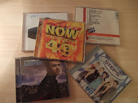
For this cover story picture I didn’t want to change a great deal because I was happy with the original. I decided to crop the photograph so that the NOW 49 album was mostly on show as the NOW album is very iconic and I wanted my readers to notice it.

For this cover story picture I again didn’t want to change a great deal because I liked the original. However I used the clone stamp tool to remove the patterns in the wall paper because I felt it distracted the attention away from the model. I also cropped it because I didn’t need all the background in the photograph.

Contents page
This photograph was taken by one of the people in my group. It is a medium shot and I used the original photograph apart from using the blur tool to remove the flash from the camera. I wanted to keep everything in the mise en scene as the props created the look of a real office.
Double page spread
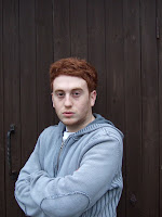
I changed the levels of the photograph to add contrast as the contrast makes the photograph look professional and as it is darker around the model it emphasizes him as he stands out more. I also edited the background by cropping it as the door handle takes away attention from the model. I lightened the bags under his eyes as he looked tired and worn out, celebrities would go through a make up process before a photo shoot, therefore by removing his bags I created a more professional look. I was able to do this by using the eye dropper tool to get the colour of his skin, I then used the brush tool, changed the opacity to 10 and changed the mode to lighten. I also zoomed in on the photograph so the model was close up.

I zoomed in on the model so he was more close up and easier to see his face. I edited the contrast of the picture and added a cooling filter because the model looked quite orange.

I kept the photograph the same because I liked the original as it was a good quality photograph and looked professional. I zoomed in on both pictures so readers were more able to see the models face.


I used the background eraser tool to remove the background because the original photograph did not appear as though it was taken in a professional studio. I kept the background plain so the models stood out more. I decided to cut out the last girl because she didn’t look as if she was close to the band. She was not standing in line with them. I added in the text using the horizontal type tool. A bra belonging to one of the girls was on show so I removed it as it did not look professional. I was able to do this by using the clone stamp tool and colouring over the purple bra. I then used the blur tool to make the skin look even.


I took the photograph in a train station originally with two people because I was planning on reviewing duet group’s single. I thought the train station sign would have been an interesting background to use however after analysing the photograph I decided a plain background would be best because a detailed background would have taken attention away from the model. I also decided to only use one person because I changed the idea of reviewing a single from a duet group to a solo artist. I removed the background using the background eraser tool, I added in the text by using the horizontal type tool. I warped the text and chose the style of shell upper to give the text an exciting look. I also removed the flash on his face because it was distracting and did not look professional. I was able to do this by using the eye dropper tool to get the colour of his skin, I then used the brush tool, changed the opacity to 10 and changed the mode to darken.


No comments:
Post a Comment