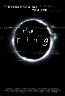
The Ring is it’s a horror a film about a cursed, disturbing videotape that, when watched, will cause the viewer to die a week after. It was released in 2002 and is a remake and also an adaption of the highly successful novel by Koji Suzuki. The director is Gore Verbinski, who is one of American cinema's most inventive directors with the ring grossing over $230 million dollars.
The poster clearly shows the image of a ring in the center to emphasis the importance of it and draw attention to it, the title is in a childish font adding a sense of eeriness to the film. The grainy somewhat dark background of the poster relates directly to the images shown in the deadly video tape. The simplicity of the poster adds to the effect of the ‘unknown’ nature of horror movies .It makes the viewer curious to find out the extent of the video tapes power. The tagline across the top of the poster “before you die, you see” is referring to the ring. The mention of death in the tagline makes it obvious to be a horror movie as death is the typical convention found in such movies, and the use of a tagline draws the viewer in further.
The white font on the black background is successful as the use of know colour adds suspense and mystery to the film. The colour black has ominous characteristics symbolizing death, but the colour white is generally related to purity for example, except in eastern cultures it is too a colour that relates to death. Bearing this in mind the ring was initially a Japanese film .The poster has no actors or actress on it even though the film actually stars Naomi Watts who is a well known actress. The poster instead sticks with the minimal theme throughout, which is however a success because the genre is established and the target audience is made clear. As it would probably be a certificate 15 + film .The poster is on the whole quite stereotypical to the genre it is trying to portray .It uses many typical codes and conventions such as the colour black. By not having too much overpowering information on the poster it makes it more likely to be taken noticed of as it is quite eye catching even though it is unfussy and simplistic.
I have already made this comment on Abbie's blog but you need to make comments on layout and design as well as content. it is a lot easier to annotate the poster itself rather than writing an essay.
ReplyDelete