These are the photos that I took to include in my media product. These are my oringinal images before I edited them on Adobe Photoshop.
Front Cover Original Image
 This is the image that I have used for my front cover. To improve the image I changed the saturation, brightness and contrast of the image. This image is a medium shot but when I added it to my magazine it turned into a medium/close up shot because I had enlarged the image. I used the blur tool to reduce the shine on the model's faces from the flash on the camera. I then used the magic wand tool on Photoshop which enabled me to delete the background of the picture. When adding the image to Publisher I had to change the size of the image so that it would fit on my front cover. So that the image would still stay in proportion I held down the shift key whilst resizing the image. I then had to crop the image to make it fit onto my front cover. I think I made my image look better by editing it because the colours became much brighter and the image looked more interesting and eye catching.
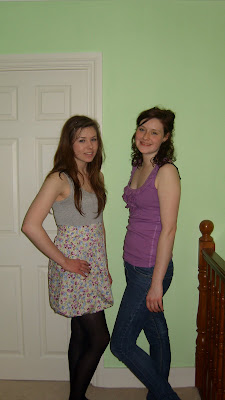
Double Page Spread Original Image 1
 This is my second original image that I used for the main page of my double page spread. I used a long shot for this image because I wanted an almost full body shot to go onto my double page spread. To edit this photo in Adobe Photoshop I changed the contrast and sharpness of the image to make the colours stand out and make it look interesting. I then used the magic wand tool to separate the models from the background because the background did not go with the theme of my double page spread. I put my models in these costumes because they are clothes from a recent trend so my target market can relate with the models. The costumes they are wearing contain similar colours like the flowers on the dress and the vest top.
Double Page Spread Orignal Image 2
 This is my second image that I used for my double page spread. It is a medium shot. Whilst editing my image in photoshop, I tried to improve the saturation and sharpness of the image. I then used the magic wand tool to remove the background and added it onto the bottom right hand corner of the second page on my double page spread. I think this is the least successful of all my images because the lighting is different from my other images. Also my other photos are more in focus.
Editors Letter Original Image

As we each needed to include four original images that we had taken ourselves in each of our magazines, I took Emma's editor's letter photo for her to use in her magazine. It is a medium shot of Emma. The props I have included in the background are a computer and other office items to make it look like she is writing an article for the magazine. To edit this photo I improved the saturation of the image and the sharpness of the image. I also used the blur tool to eliminate the shine from the flash of the camera.


 This is my second image that I used for my double page spread. It is a medium shot. Whilst editing my image in photoshop, I tried to improve the saturation and sharpness of the image. I then used the magic wand tool to remove the background and added it onto the bottom right hand corner of the second page on my double page spread. I think this is the least successful of all my images because the lighting is different from my other images. Also my other photos are more in focus.
No comments:
Post a Comment