Smash Hits magazine is music magazine that was aimed at a young teenage audience, although it is no longer being created. Neither is the other music magazine ‘Top of the Pops’ which was also aimed at the same audience and had similar codes and conventions. This could mean that there is a gap in the market for a music magazine aimed at young teens. This information will help me when it comes to deciding on my target age group.
Smash Hits magazine was published fortnightly by EMAP. When you look at the front cover of the magazine, the viewer can immediately recognise that the magazine is aimed mainly at females. This is due to its denotations and connotations. I will use the migrain model to analyse this median. The type of media for Smash Hits magazine is print, in the form of a magazine. The ideology of Smash Hits is that it is quite informal. Also, because it is for a younger audience, the words and type of language used is quite simple so that it can be understood by its target audience.
The genre of Smash Hits magazine is that it is a music magazine. The representation of the magazine is that it is made to look fun and interesting by its bright, bold colours, fonts and images. The audience for Smash Hits is quite mainstream because it appeals to most young teenage females. The specific targeting could be identified by the masthead of Smash Hits because it is bright pink which symbolises that is made for females.
The institution of Smash Hits magazine is EMAP. They are a big company that manufactures many other popular magazines. The narrative of Smash Hits magazine is quite simple so it appeals to its target audience. Short, concise sentences are used and the magazine follows the same plot and structure throughout every issue so that it develops a house style and can be recognised by its readers.
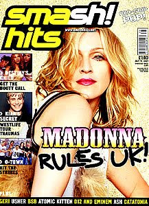
I will analyse the front cover of an issue of Smash Hits magazine to gain a more detailed understanding of the image of Smash Hits. The majority of the front cover is dominated by its main image which is a photo of a popular boyband at that time which was the ‘Backstreet Boys.’ The camera is at a high angle long shot so that the reader can see what the band is wearing. The front cover is quite simplistic compared to the other magazines I have analysed. The main coverline is written across the centre in a bold font that stands out from the background. There is other text underneath the coverline in smaller, different coloured font to briefly explain what the main story is about.
 The masthead is first thing that the viewer sees when looking at the front cover of Smash Hits magazine because it stands out from the background. ‘Smash Hits’ is in a bold, clear, bright pink font which makes it very eye catching. There is a tagline in a different smaller font underneath the masthead that reads, ‘Non-stop pop.’ This tells the reader what the magazine is about because from this the reader can tell it is a music magazine.
Other denotations of Smash Hits magazine are that there are smaller photos of other celebrities along the bottom that advertise other stories that are in the issue. Some denotations are kept the same throughout each issue such as font, colours and the masthead. This also helps to produce a house style and produces a constant connotation of the magazine.
I will analyse the contents page to see how the codes and conventions and other factors are kept constant throughout the issues. At the top of the contents page t says, ‘Check all this out!’ It is in a bold, noticeable font and because it is in informal language it appeal to a younger audience. The Editors letter is in the top left hand corner of the page and it consists of what is going on in the issue and artists that feature in the magazine.
There are three images of celebrities surrounding the Editor’s letter and the celebrities pictured are involved in the issue. The page number they are on is shown beside the image to advertise the story. The other stories and features are listed in a smaller font at the bottom in another section. The main colours used in the contents page are pink and orange. These are used because they are popula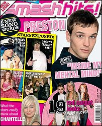 r colours with Smash Hits target market.
Other smaller images can be seen along the bottom of the contents page which makes it look interesting because there is a lot going on. The contents page is quite detailed with lots of photos which would make the reader excited about the magazine and makes them want to read on. Smash Hits’ contents page is different from the other magazines contents pages I have analysed because the others were not as detailed. This could show the differences between the two target age groups and what appeals to them.
As I plan to do an interview for my double page spread when I create my own music magazine, this is what I will analyse from the Smash Hits magazine. The first thing the reader notices when reading the double page spread interview is the bright yellow background. The majority of the first page is covered by a photo of the featured celebrity. There are three other images of the celebrity splashed across the pages. The main title is spread along the centre. It is big and in a bold, clear font. The text is yellow so it matches the background but it is on a purple banner so that it stands out.
Like the two other double page spreads I have analysed, there is smaller text that accompanies the title, that gives a brief introduction and explanation of what is going on in the text. The main text is split into different sections to make it easier to understand. Smash Hits interview has similarities with Heat magazines interview, because some quotes stand out from the text and are in bold so that they are easily recognised.
The language used throughout the interview is simple and informal, so that it is easily understood and slang words and phrases are used to appeal to the target market. The main difference between the double page spread in Smash Hits compared to the other magazines double page spreads I have analysed, is the colours and presentation. This is because Smash Hits doesn’t look as professional and sophisticated. This could be because the audience for Smash Hits isn’t as mature as the audience for Heat and Look magazine.
In conclusion, by analysing the features of Smash Hits magazine I can see how its denotations, connotations, ideologies, codes and conventions are kept constant throughout the issue because they represent the same image of a music magazine aimed at young teenage females. The analysis I have completed on Smash Hits has also been very helpful because it has enabled me to identify a gap in the market for a music magazine. In my analysis I have included examples of Smash Hits magazines front covers and logos.
Smash Hits magazine was published fortnightly by EMAP. When you look at the front cover of the magazine, the viewer can immediately recognise that the magazine is aimed mainly at females. This is due to its denotations and connotations. I will use the migrain model to analyse this median. The type of media for Smash Hits magazine is print, in the form of a magazine. The ideology of Smash Hits is that it is quite informal. Also, because it is for a younger audience, the words and type of language used is quite simple so that it can be understood by its target audience.
The genre of Smash Hits magazine is that it is a music magazine. The representation of the magazine is that it is made to look fun and interesting by its bright, bold colours, fonts and images. The audience for Smash Hits is quite mainstream because it appeals to most young teenage females. The specific targeting could be identified by the masthead of Smash Hits because it is bright pink which symbolises that is made for females.
The institution of Smash Hits magazine is EMAP. They are a big company that manufactures many other popular magazines. The narrative of Smash Hits magazine is quite simple so it appeals to its target audience. Short, concise sentences are used and the magazine follows the same plot and structure throughout every issue so that it develops a house style and can be recognised by its readers.
I will analyse the front cover of an issue of Smash Hits magazine to gain a more detailed understanding of the image of Smash Hits. The majority of the front cover is dominated by its main image which is a photo of a popular boyband at that time which was the ‘Backstreet Boys.’ The camera is at a high angle long shot so that the reader can see what the band is wearing. The front cover is quite simplistic compared to the other magazines I have analysed. The main coverline is written across the centre in a bold font that stands out from the background. There is other text underneath the coverline in smaller, different coloured font to briefly explain what the main story is about.
 The masthead is first thing that the viewer sees when looking at the front cover of Smash Hits magazine because it stands out from the background. ‘Smash Hits’ is in a bold, clear, bright pink font which makes it very eye catching. There is a tagline in a different smaller font underneath the masthead that reads, ‘Non-stop pop.’ This tells the reader what the magazine is about because from this the reader can tell it is a music magazine.
Other denotations of Smash Hits magazine are that there are smaller photos of other celebrities along the bottom that advertise other stories that are in the issue. Some denotations are kept the same throughout each issue such as font, colours and the masthead. This also helps to produce a house style and produces a constant connotation of the magazine.
I will analyse the contents page to see how the codes and conventions and other factors are kept constant throughout the issues. At the top of the contents page t says, ‘Check all this out!’ It is in a bold, noticeable font and because it is in informal language it appeal to a younger audience. The Editors letter is in the top left hand corner of the page and it consists of what is going on in the issue and artists that feature in the magazine.
There are three images of celebrities surrounding the Editor’s letter and the celebrities pictured are involved in the issue. The page number they are on is shown beside the image to advertise the story. The other stories and features are listed in a smaller font at the bottom in another section. The main colours used in the contents page are pink and orange. These are used because they are popula
 r colours with Smash Hits target market.
Other smaller images can be seen along the bottom of the contents page which makes it look interesting because there is a lot going on. The contents page is quite detailed with lots of photos which would make the reader excited about the magazine and makes them want to read on. Smash Hits’ contents page is different from the other magazines contents pages I have analysed because the others were not as detailed. This could show the differences between the two target age groups and what appeals to them.
As I plan to do an interview for my double page spread when I create my own music magazine, this is what I will analyse from the Smash Hits magazine. The first thing the reader notices when reading the double page spread interview is the bright yellow background. The majority of the first page is covered by a photo of the featured celebrity. There are three other images of the celebrity splashed across the pages. The main title is spread along the centre. It is big and in a bold, clear font. The text is yellow so it matches the background but it is on a purple banner so that it stands out.
Like the two other double page spreads I have analysed, there is smaller text that accompanies the title, that gives a brief introduction and explanation of what is going on in the text. The main text is split into different sections to make it easier to understand. Smash Hits interview has similarities with Heat magazines interview, because some quotes stand out from the text and are in bold so that they are easily recognised.
The language used throughout the interview is simple and informal, so that it is easily understood and slang words and phrases are used to appeal to the target market. The main difference between the double page spread in Smash Hits compared to the other magazines double page spreads I have analysed, is the colours and presentation. This is because Smash Hits doesn’t look as professional and sophisticated. This could be because the audience for Smash Hits isn’t as mature as the audience for Heat and Look magazine.
In conclusion, by analysing the features of Smash Hits magazine I can see how its denotations, connotations, ideologies, codes and conventions are kept constant throughout the issue because they represent the same image of a music magazine aimed at young teenage females. The analysis I have completed on Smash Hits has also been very helpful because it has enabled me to identify a gap in the market for a music magazine. In my analysis I have included examples of Smash Hits magazines front covers and logos.
No comments:
Post a Comment